DUTCHMAN’S GOLD
BRAND IDENTITY / PACKAGE DESIGN / WEBSITE DESIGN
SHOWCASING OVER 40 YEARS OF FAMILY TRADITION
From humble beginnings in 1981, the Van Alten family launched Dutchman’s Gold in the small town of Carlisle, Ontario, selling bottled honey off the front porch of their family home and at local farmer’s markets. Now, they’ve grown to sourcing and selling honey products across Canada — always delivering the premium quality honey products you’ve come to expect from Dutchman’s Gold.
As we work alongside the Dutchman’s Gold team to redefine their brand, our goal was always to showcase their rich company history and present a strong, quality-driven message with each piece of creative – including their logo design, 40th anniversary commemorative logo, packaging, advertising and digital marketing.
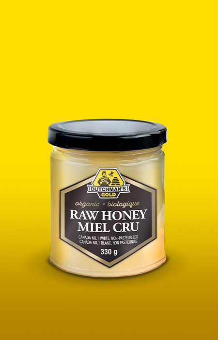


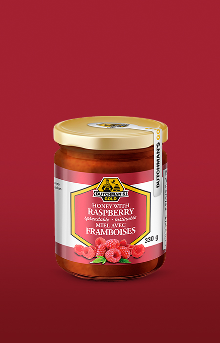
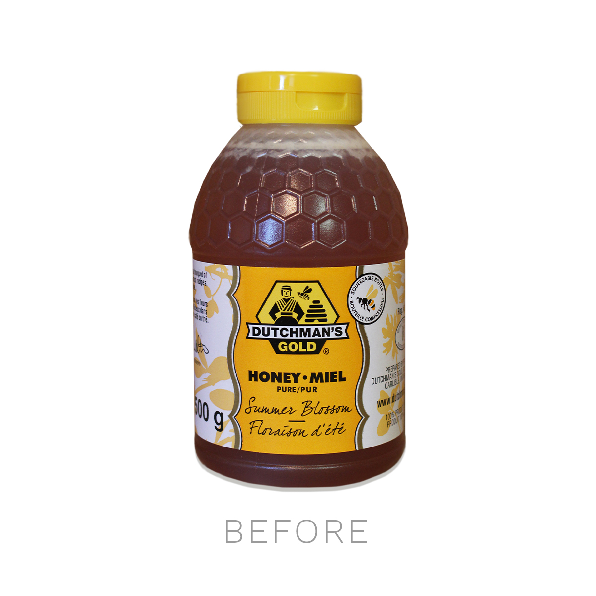
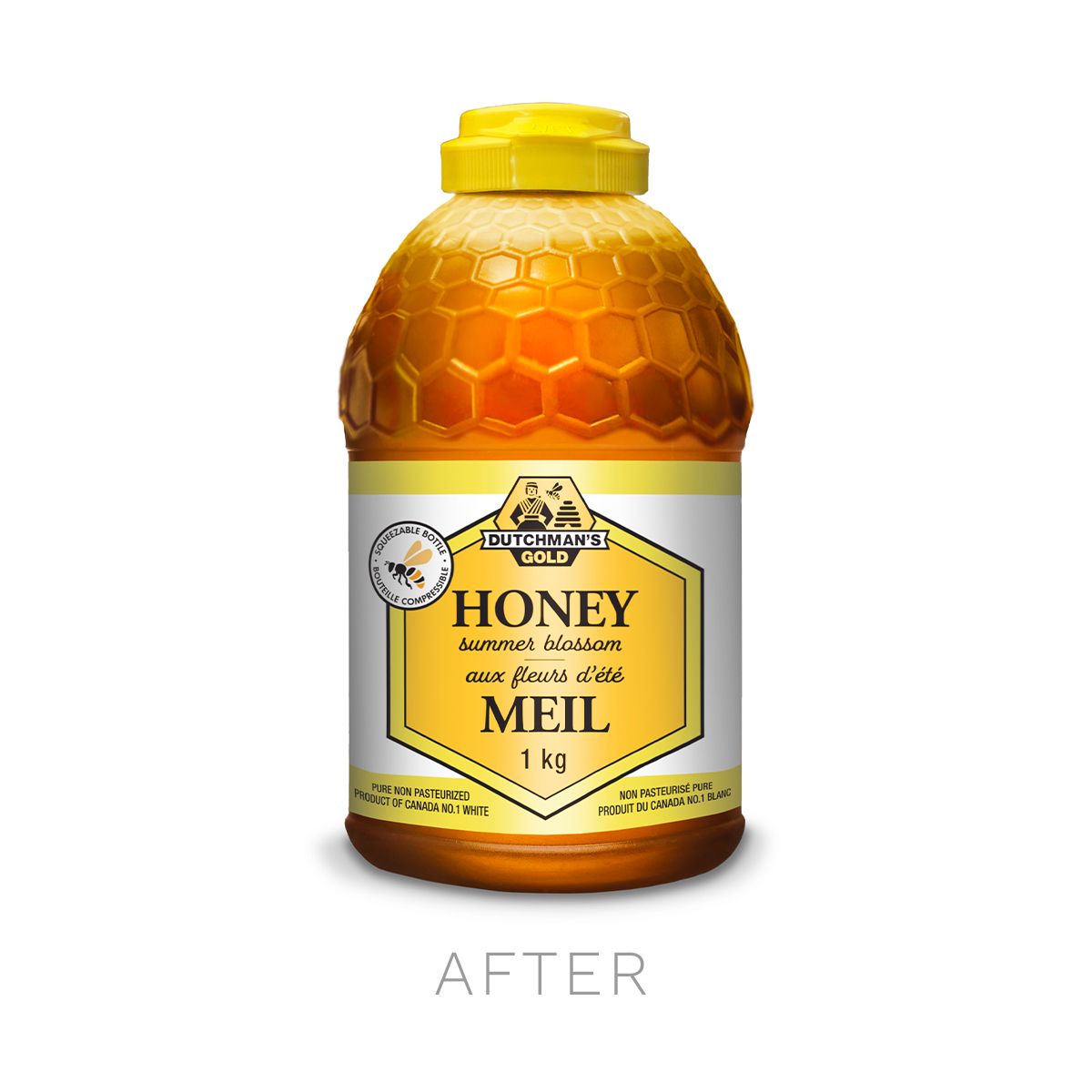
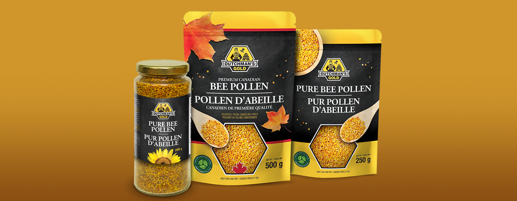
PACKAGING
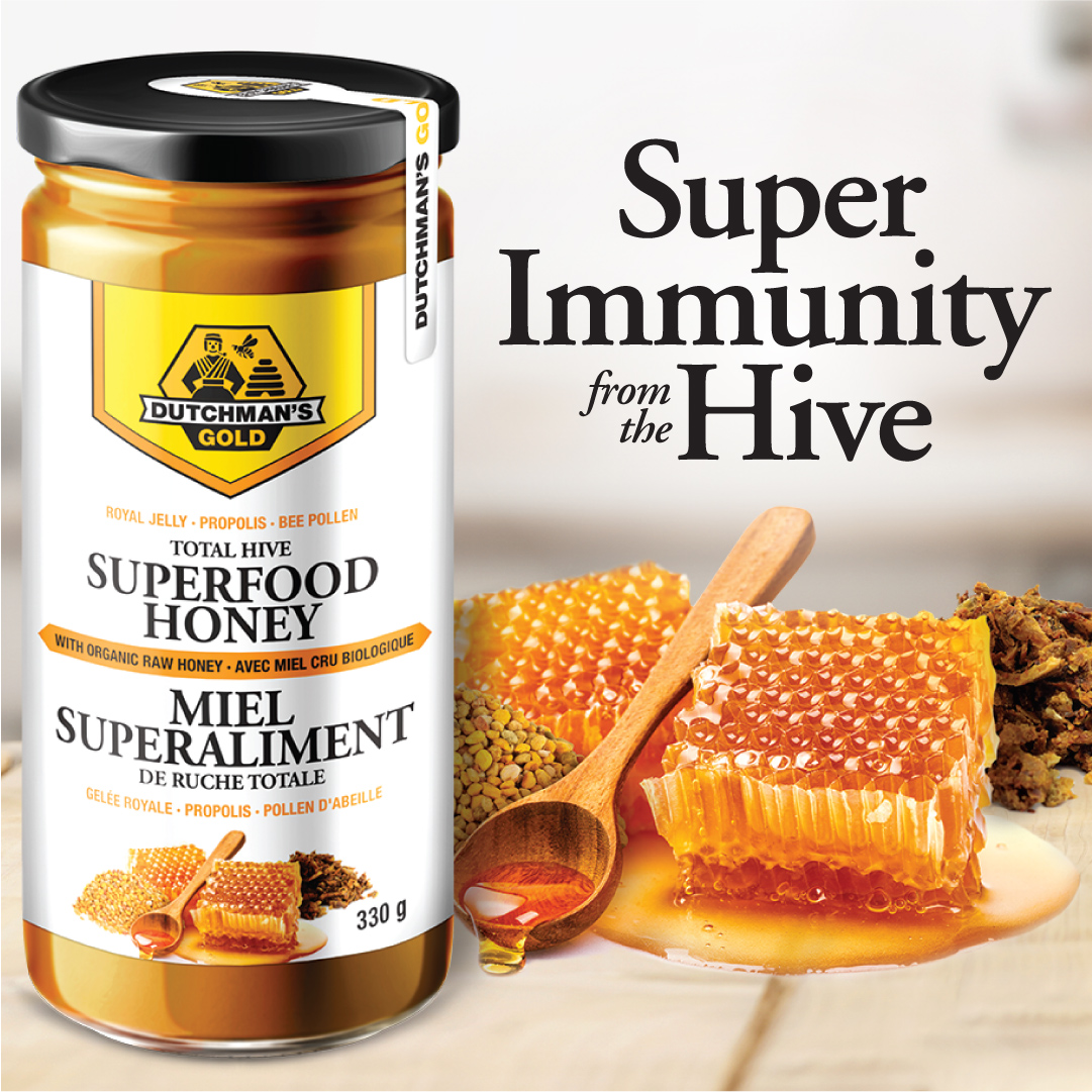
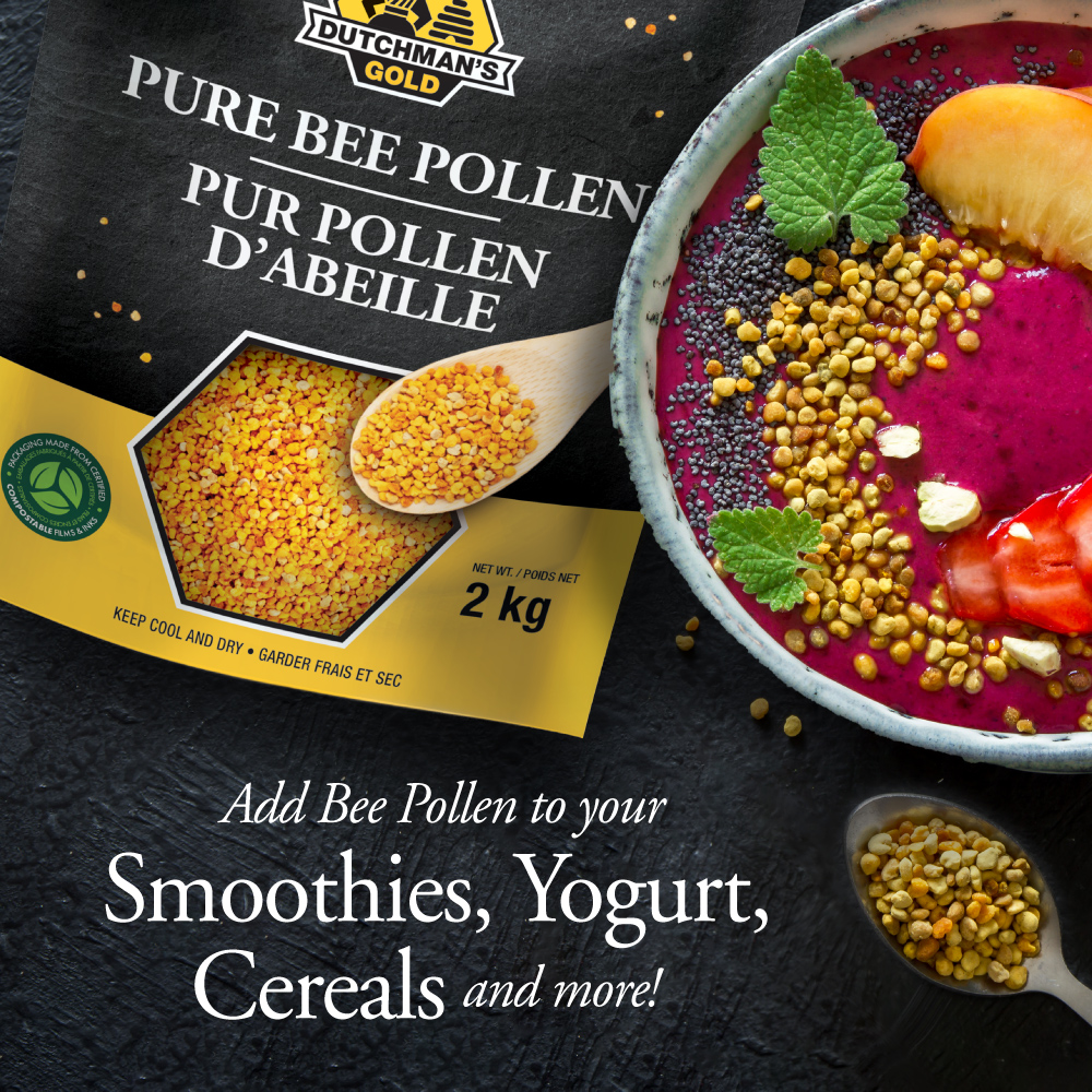
Over the course of our long business relationship with Dutchman’s Gold, we have created a large family of packaging including everything from honey to maple syrup, candles, beauty products and more. With each package, we strive to create a consistent look to uphold Dutchman’s Gold’s unique brand identity while allowing each package to stand out from competitors.
BRANDING
As the business has grown, the Dutchman’s Gold brand has grown alongside it! Since we began working with Dutchman’s Gold, we’ve helped to refine their branding, including their recent 40th Anniversary logo, and help to create new sub brands, like Beauty & The Bee beauty and skin care products.
WEBSITE DESIGN & MAINTENANCE
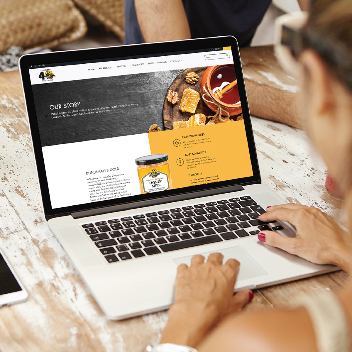
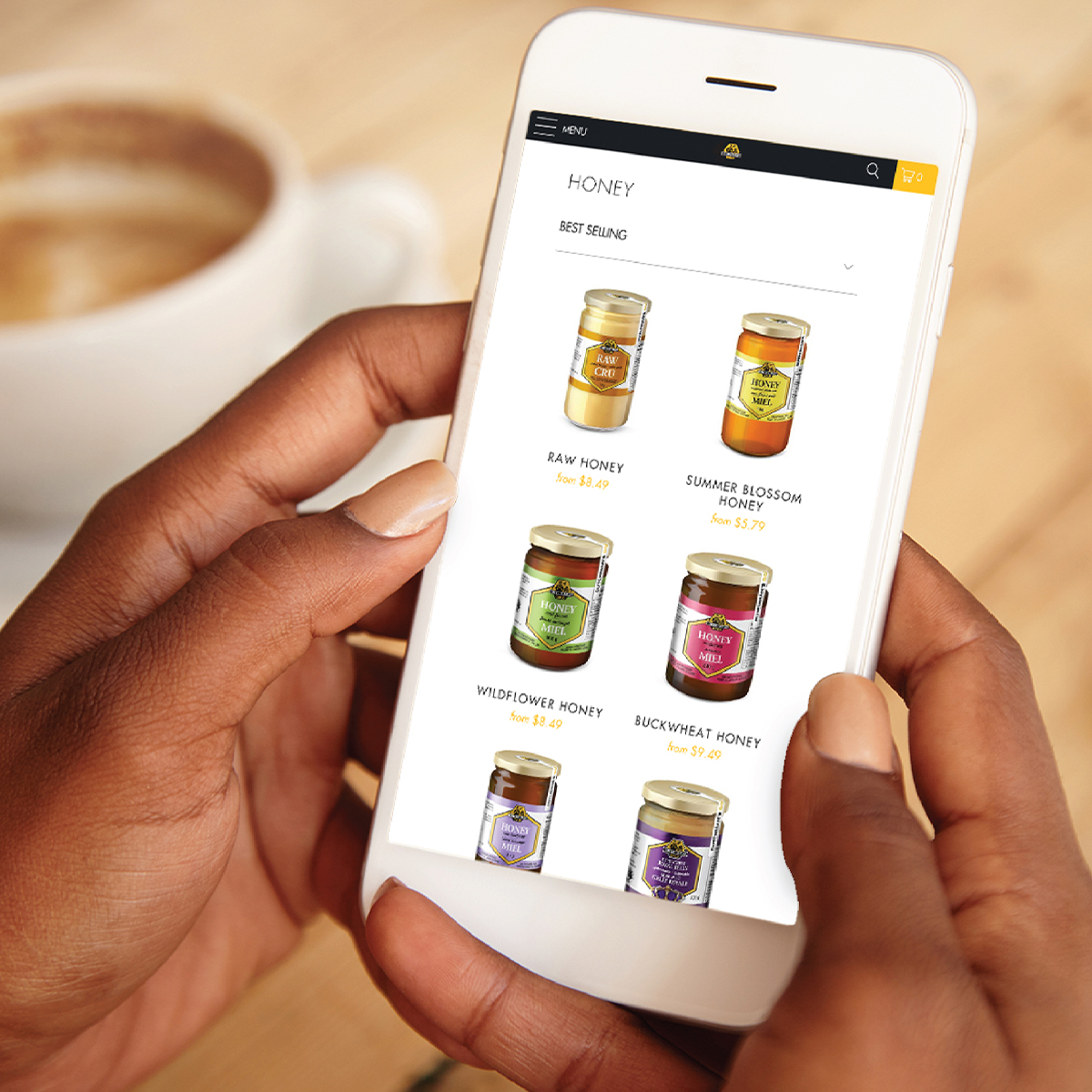
When Dutchman’s Gold came to us to upgrade their existing website, we took the opportunity to develop a more strategic website design within their existing Shopify platform. Not only did it improve the overall user-experience, but it helped to boost their organic SEO rankings and conversions. Since the site design update, we’ve also become Dutchman’s go-to web partner to keep their website up to date and functioning well!
